

Site News
Ten HD New Watermark
Update: Watermark changes - 18/12/2007
The watermark has undergone a change is size and opacity. The odd thing currently is that the brightness differs throughout a program, possibly for testing.

As can be seen in the image above, the size is more in line with other stations offerings. Please Click the image for the 1:1 scale original.
Original article:
After a quick appearance the day earlier, Ten finally rolled out their new HD watermark. Unlike all other stations, they have placed the logo at the top left of the screen and have made it around double the size.

To complete the package, the program name after returning from commercial has also been updated. Starting with the top image, the program name slides and spins to reveal the second part before doing the reverse and then fading to the watermark.
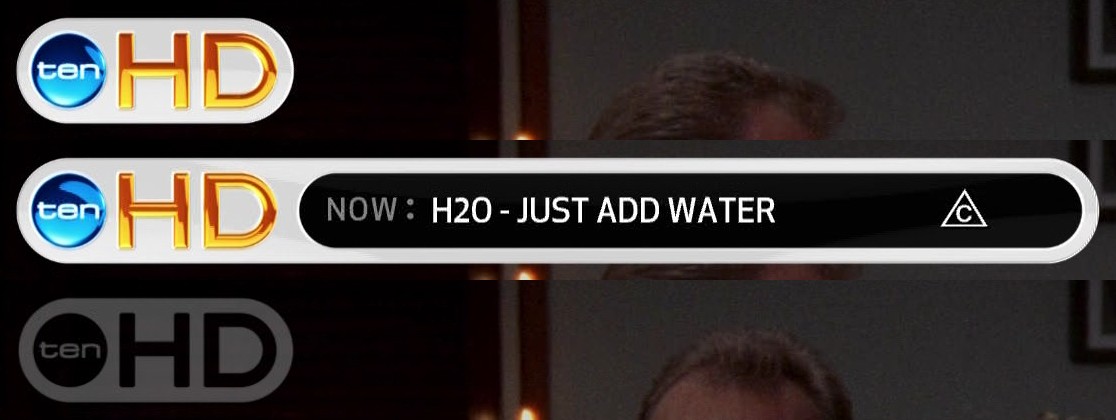
While the package looks impressive, it is far too large and highly distracting for viewing. It really needs to be reduced in size and perhaps even changed to the lower left ala NBC in the US.
Remember to click the images for their full sized versions and be tuned on Sunday, 16th December for the official launch of Ten HD.